
Choose a warm white for rooms with limited natural light or with wood tones and brass fixtures, and choose a cool white for sunlit rooms with chrome, marble, or black modern accents. Undertones read differently on a full wall than on a paint chip, so test large samples for several days before committing. If your fixed finishes send mixed signals or you want the trim and ceiling coordinated correctly the first time, hiring a painting contractor removes the guesswork.
TL;DR:
- Choosing the right white depends on your room’s natural and artificial light, with north-facing spaces favoring warm whites, while south-facing rooms can handle cooler tones.
- Test large paint patches for at least four days under different lighting conditions, including natural and artificial light, to accurately assess undertones before committing.
- Coordinate wall colors with fixed finishes by matching undertone families, such as warm whites with wood and brass, and cool whites with marble and chrome, to avoid visual clashes.
- Mismatched undertones between wall and trim often require repainting, but minor conflicts can sometimes be fixed by changing bulbs or sheen levels.
- Hiring a professional ensures precise color matching and proper application, especially when resale value or finish conflicts are involved.
Table of Contents
- Warm White vs Cool White: The 6-Factor Decision Checklist
- How Light and Room Orientation Change the Way Undertones Read
- Coordinating Whites With Trim, Ceilings, and Fixed Finishes
- How to Test Whites on Your Wall Before You Commit
- Common Mistakes That Send Homeowners Back to the Paint Store
- Why Getting the Undertone Right Usually Means Hiring a Professional
- How 5starpainting Handles Warm White vs Cool White for You
- Sources
- FAQ
Warm White vs Cool White: The 6-Factor Decision Checklist
Before you buy a single sample pot, run through these six factors. Each one nudges your decision in a specific direction, and conflicts between them are exactly where DIY paint choices go wrong.
- Light mix and bulb kelvin. Rooms lit mostly by warm-color temperature bulbs favor warm whites; rooms with higher-color temperature fixtures or lots of daylight tend to suit cooler whites.
- Room orientation. North-facing rooms get flatter, cooler daylight, so warm whites keep walls from looking dull or gray. South-facing rooms get strong warm sunlight and can handle either undertone.
- Dominant fixed finishes. Wood flooring, brass hardware, and stone countertops with beige veining pull toward warm white. Chrome, marble, and black steel accents pull toward cool white.
- Sightlines to adjacent rooms. If your living room is visible from the kitchen, mismatched undertones will look like an accident, not a design choice.
- Desired mood. Warm white reads cozier and more relaxed; cool white reads crisper and more modern.
- Resale and maintenance. Neutral-leaning whites tend to age better across trends and are easier for future buyers to picture their own furniture against.
Pro Tip: When your flooring says warm but your countertop says cool, side with the fixed element that costs the most to replace. Furniture and rugs can change next year; cabinetry and floors usually can’t.
How Light and Room Orientation Change the Way Undertones Read
Room orientation is a tendency, not a rule, because it interacts with everything else in the room’s light mix. North-facing rooms often benefit from warm-toned whites since the indirect, cooler daylight they receive can make a cool white look flat or even slightly blue. South-facing rooms tolerate both warm and cool whites because abundant warm sunlight balances either undertone. In fact, designers sometimes lean cooler in south-facing rooms specifically because a bright pure white can start to feel glaring once the afternoon sun hits it directly.
Artificial light complicates the picture further. A 2700K warm bulb will push almost any white toward cream, while a 5000K to 6500K daylight bulb pulls the same paint toward gray or blue. That’s why the same gallon of paint can look completely different in a bedroom lit by lamps versus a kitchen lit by overhead daylight LEDs.
To check this properly:
- Paint a sample patch at least two feet wide, not a small swatch.
- Photograph it in the morning, midday, and evening under natural light, plus once with the room’s usual artificial lighting on after dark.
- Note the kelvin rating printed on your bulb packaging, since it explains half of what you’re seeing.
- Compare the patch against the room’s brightest wall and its darkest corner.
A typical outcome: a north-facing bedroom with warm white looks soft and inviting by lamp light, while the same color in a south-facing sunroom can look slightly washed out by early afternoon.
Coordinating Whites With Trim, Ceilings, and Fixed Finishes
Undertones don’t exist in isolation. A wall color that looks perfectly balanced on its own can clash the moment it sits next to your flooring or cabinetry. Warm whites generally harmonize with natural wood and brass, while cool whites sit better against chrome, marble, and concrete.
- Wood floors and brass hardware: lean warm to avoid a yellow-versus-gray tug-of-war.
- Marble counters and chrome fixtures: lean cool for a cleaner, more cohesive look.
- Mixed metals or transition hallways: a neutral white often reads better than committing to either extreme, especially where adjacent rooms have different color temperatures.
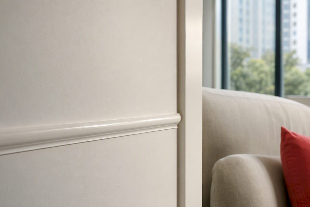
For trim, match its temperature to the wall’s undertone, or default to a neutral trim white if the wall color is bold. Ceilings usually work best in a neutral or slightly cooler white than the walls, since ceiling paint reflects more ambient light and any warm undertone gets amplified overhead.
Sheen matters too. Higher-sheen finishes reflect more light, which intensifies whatever undertone is already there. That’s a reasonable argument for keeping walls in flat or matte and saving satin or semi-gloss for trim, where a bit of undertone punch is usually welcome rather than distracting.
How to Test Whites on Your Wall Before You Commit
Paint chips lie. A color that looks neutral on a two-inch strip can turn distinctly yellow or blue once it covers 200 square feet under your actual lighting. Undertones are subtle on chips and only reveal themselves on full walls, so skipping this step is the single most common reason homeowners end up repainting within a year.
- Paint at least two large patches per candidate, on different walls of the room.
- Live with them for four days minimum, checking morning, midday, and evening light.
- Hold a plain sheet of white printer paper next to each patch. If the paint looks cream against the paper, it’s warm; if it looks similar or slightly gray, it’s cool or neutral.
- Photograph each patch against your flooring, cabinetry, or countertop.
- Record the kelvin rating of your main light fixtures for reference.
If a contractor is quoting the job, expect them to mix a consistent batch across the whole room and label leftover paint for future touch-ups, ensuring color consistency.
Pro Tip: If artificial light dominates the room, temporarily swap in a different-kelvin bulb during your test window. It’s the cheapest way to rule out “is this the paint or the light?” before buying more sample pots.
Common Mistakes That Send Homeowners Back to the Paint Store
Most repaint regrets trace back to the same handful of mismatches, and nearly all of them are avoidable with a longer sampling window.
- Warm white paired with cool-toned flooring and high-kelvin LED bulbs often reads yellow instead of soft and creamy.
- Cool white in a dim bathroom with no natural light can look sterile or clinical rather than crisp.
- Trim and wall whites from different undertone families create a visible seam where they meet, even if each looks fine alone.
- If sample patches read differently depending on which corner of the room you’re standing in, that’s a signal to call a professional rather than keep guessing at swatches. A contractor experienced in color matching can usually diagnose the conflict fast.
When the fix is a bulb swap or a sheen change, save your money. When wall and trim genuinely fight each other, a repaint is the only real cure.
Why Getting the Undertone Right Usually Means Hiring a Professional
Getting undertones right on paper is one thing. Getting a consistent batch mixed, applied evenly across every wall, and paired correctly with trim and ceiling is a different skill set entirely. Professional painters bring controlled sampling, precise sheen selection, and project timelines that keep a job from stalling halfway through. Contributing writer Fabian, who covers residential finishing trends for this publication, notes that most of the “wrong white” complaints he hears trace back to skipped sampling steps, not bad color choices. Hiring a pro pays off most when finishes conflict or resale is on the line; simple, low-stakes rooms are often fine for homeowners to sample themselves.

How 5starpainting Handles Warm White vs Cool White for You
If you’d rather skip weeks of testing patches and comparing kelvin ratings, 5starpainting builds that sampling discipline into every quote. The company uses genuine Nippon Paint and assigns a personal project manager to each job, so the undertone decisions you read about above get handled on-site instead of left to guesswork.

A visit typically includes checking your fixed finishes against sample patches, recommending sheen levels for walls versus trim, and confirming color matching before the crew starts. Pricing covers labor, furniture protection, and cleanup, and every job carries a warranty. If you’re outfitting a new flat, the HDB painting services page has current package details, and condo owners can check the condo painting services page for scope and pricing. Either way, the next step is the same: request a quote and let a project manager walk you through the warm-versus-cool decision on your actual walls.
Sources
- How to choose the best white paint color (HouseBeautiful)
- How to choose the best white paint color: a 5-step guide (WonderHowTo/Interior design)
FAQ
Is Warm White or Cool White Better for a Living Room?
It depends on your light and finishes: warm white suits living rooms with wood floors, indirect light, or brass fixtures, while cool white suits sunlit living rooms with marble or chrome accents.
How Long Should I Test a Paint Sample Before Deciding?
Test large patches for at least four days, checking them under morning, midday, evening, and artificial light before making a final call.
Does Cool White Always Look Better in Bathrooms?
Not always. Cool white can look clinical in a dim, low-light bathroom, so a slightly warmer or neutral white often reads better without harsh overhead lighting.
Should Trim Be the Same Undertone as the Walls?
Match trim temperature to your wall’s undertone, or use a neutral trim white if you’re unsure. Mismatched families create a visible seam where trim meets wall.
Can a Professional Painter Fix a Wrong White Choice Without Repainting?
Sometimes. A contractor can diagnose whether a bulb swap or sheen change solves the problem, but a genuine undertone clash between wall and trim usually requires a repaint.