
Light, high-LRV neutrals make a small room feel bigger by bouncing available light around the space. Deep, saturated colors do the opposite on purpose, pulling walls inward for a cocooned, intentional feel, but only when the room has enough natural light to support them. Three safe starting points cover most situations: a warm off-white or light greige for opening things up, a soft blue or green for an airy middle ground, and a deep jewel tone like teal or forest green for a small room you want to feel rich rather than cramped.
- Want it bigger and brighter: stick with light neutrals above 70 LRV.
- Want it calm and open: try a soft blue-green in the 50 to 65 LRV range.
- Want it cozy and dramatic: go deep with charcoal, teal, or forest green, drenched wall to ceiling.
Light, bright colors generally make small rooms feel larger, while deep, saturated colors read as intentional depth rather than a mistake, once you’ve sampled and confirmed the light supports it.
Key Takeaways
Light neutrals with high LRV open up small rooms, while deep saturated colors work only when paired with strong natural light and consistent application.
| Point | Details |
|---|---|
| Check LRV first | Aim above 60 LRV for dim rooms and 25 to 45 for well-lit rooms that can handle depth. |
| Sample on multiple walls | Apply two coats of peel-and-stick or pot samples and live with them for several days. |
| Match undertones to floors and trim | Hold large samples against flooring and cabinetry before committing to a color. |
| Use low contrast to expand space | Paint trim the same shade as walls to remove visual breaks in small rooms. |
| Hire a pro for flawless execution | 5starpainting offers all-inclusive HDB and condo painting packages with a one-year warranty. |
Where to Learn More About Small Room Paint Colors
Sherwin-Williams explains LRV and room-size guidance in depth. Redfin covers step-by-step sampling. Benjamin Moore curates small-space color ideas, and Southern Living offers designer-backed examples of colors that work in tight rooms.
Table of Contents
- Small Room Paint Colors by Family: What Actually Works
- How Do Lighting and LRV Change Paint Color?
- Undertones, Flooring, and Trim: Avoiding a Clash
- Painting Techniques That Change How Small Rooms Feel
- Testing Small Room Paint Colors Before You Commit
- Frequently Asked Questions
- Sources
Small Room Paint Colors by Family: What Actually Works
Every small room paint decision starts with a color family, not a specific chip. Once you know which family fits your room’s light and function, narrowing to an exact shade gets a lot easier.
Light neutrals and high-LRV whites do the heaviest lifting in rooms with limited windows or low ceilings. Whites and warm off-whites above roughly 70 LRV reflect the most available light, which is why they show up so often in guides on light paint colors for small spaces. Pair them with warm wood tones or brass fixtures so the room doesn’t feel sterile.
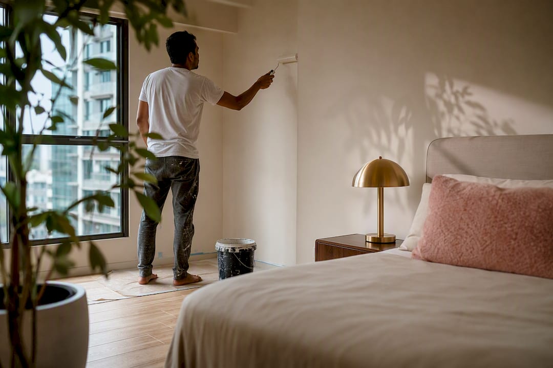
Soft blues and greens sit a notch below whites on the LRV scale but still recede visually, which is why designers reach for them in small bedrooms and reading nooks. Cooler tones tend to work best in rooms that get strong afternoon sun, since the warmth of direct light balances the coolness of the paint.
Warm neutrals and greiges split the difference. A greige with warm undertones adds coziness without dragging LRV down far enough to shrink the room. These work particularly well in small living rooms or home offices where you want warmth but still need the space to function during the day.
Deep saturated colors — think charcoal, teal, or forest green — are the family most homeowners avoid and most designers push readers toward for small spaces with good bones. Deep, moody colors can create genuine depth in a powder room, library nook, or small bedroom, especially when the room has architectural detail or reliable natural light to keep it from feeling like a cave.
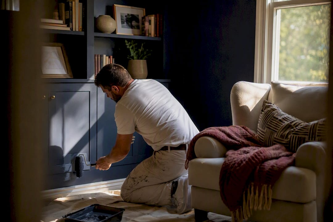
How you apply any of these matters as much as the color itself. All-over application on every wall reads as one continuous volume, which often makes a small room feel larger than a single accent wall does, because there’s no visual stopping point. A single accent wall adds focus and depth without committing the whole room. Painting the ceiling the same color as the walls, meanwhile, removes the line where wall meets ceiling entirely.
Pro Tip: If you’re nervous about a deep color, test it on the wall opposite the main light source first. That’s where dark paint reads richest instead of muddy.
How Do Lighting and LRV Change Paint Color?
Light Reflectance Value measures how much light a color bounces back, on a scale from 0 (absolute black) to 100 (pure white). LRV is a practical decision tool rather than a matter of taste, and it’s the single most useful number for predicting how a color will actually behave in your room before you buy a gallon.
For small or dim rooms, aim for LRV 60 and above if the goal is to open the space up. Rooms with strong, consistent natural light can handle LRV in the 25 to 45 range without feeling closed in, which is the range where most of those moody teals and charcoals live.
Before you commit to a shade, walk the room at three different times:
- Morning light tends to be cooler and can make warm colors look flat or gray.
- Afternoon light is usually warmer and more forgiving, especially for cooler paint families.
- Evening light, mostly from your bulbs, is where color temperature matters most. A 2700K bulb warms up a cool gray; a 4000K bulb can make the same gray look sterile.
Keep an eye out for glare off glossy surfaces and any spot where the color visibly shifts hue as the light changes. A lighter ceiling than the walls almost always helps a small room, and matching your trim to your wall color, rather than the traditional bright white, softens the line between surfaces so the room reads as one continuous shape instead of a series of boxed-in panels.
Undertones, Flooring, and Trim: Avoiding a Clash
Undertones are the subtle hue hiding inside a color that only shows up next to other materials, and they’re the reason a paint chip that looked perfect in the store can look wrong on your wall. A gray with a blue undertone will read as cold next to warm oak flooring. A greige with a pink undertone can clash with cool-toned quartz countertops.
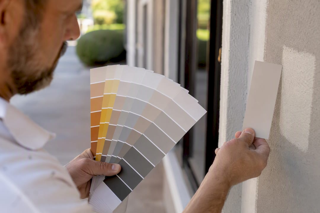
The only reliable way to catch this before you paint is to hold a large sample directly against your flooring, baseboards, and any furniture that’s staying in the room.
- Tape an 8×10 inch sample to the wall next to your floor transition and check it in daylight and lamp light.
- Hold the sample next to cabinetry or trim if the room connects to a kitchen or hallway.
- Look specifically for a color shift at the edges where the sample meets another material.
- If two adjacent rooms will show the same doorway sightline, repeat the undertone across both spaces rather than switching families.
Low contrast, where trim and walls share the same undertone family, makes small rooms read as more expansive because there’s no hard visual break. Painting trim the same color as the walls is one of the simplest ways to achieve this. Save deliberate contrast, like a dark door in a light room, for spaces where you want a focal point rather than flow. Interior doors are a common spot for that kind of contrast, and choosing the right door color is worth thinking through separately from your wall color.
Painting Techniques That Change How Small Rooms Feel
A handful of application choices matter more than the paint chip itself once you’ve settled on a color family.
- Colour drenching — painting walls, trim, and ceiling the same shade — blurs every hard edge in the room. Drenching is a designer trick that works especially well in awkward, chopped-up small rooms with multiple angles.
- Accent walls add depth without shrinking the room, but only on the wall farthest from the door, never on the wall you see first when entering.
- Ceilings painted a shade lighter than the walls lift the eye upward; painted the exact same color, they disappear into the drench effect above.
- Sheen does real work here too. Satin or eggshell on walls keeps glare down, while a higher sheen on doors and trim reflects light selectively without washing out the whole room.
Pro Tip: Save high-gloss for millwork only. A glossy wall in a small room shows every roller mark and bounces light unevenly, which undoes the calm effect you’re going for.
Testing Small Room Paint Colors Before You Commit
Skipping this step is the single most common reason a “perfect” color looks wrong once it’s actually on the wall.
- Order peel-and-stick samples or 8 oz sample pots in your top two or three finalists.
- Apply two coats to at least two different walls, including one section near trim or flooring.
- Live with the samples for three to five days, photographing them each morning and evening.
- Run a final checklist: confirm the LRV matches your goal, hold the sample next to your furniture, and check your gut reaction after a few days rather than the first hour.
Testing samples on multiple walls at different times of day catches problems a single swatch card never will. Peel-and-stick samples are worth the small extra cost because they move between rooms and wrap around corners, showing you how a color behaves at an angle instead of flat on a card. If you’re unsure how much paint the room will actually need once you’ve picked a winner, a paint coverage calculator saves you from buying too much or running short mid-coat.
A Trade Perspective on Small Room Color Mistakes
Most color mistakes trace back to skipped sampling or rushed surface prep, not the shade itself. Poor prep makes even the right color look uneven and patchy on the wall.
How 5starpainting Handles the Hard Part
Choosing the right family and testing samples gets you most of the way there. Getting a flawless, even finish on the walls is a separate skill, and it’s where a professional crew earns its cost, especially in a small room where every imperfection sits closer to eye level. 5starpainting brings over 30 years of experience to HDB flats, condos, and landed properties across Singapore, with all-inclusive pricing that covers labor, genuine Nippon Paint, furniture protection, and cleanup, with no hidden fees added later.

Hiring a pro makes the most sense for larger jobs, tricky finishes like deep drenched colors that need flawless edges, or simply when your schedule doesn’t allow for the trial-and-error of DIY sampling and repainting. Every job gets a dedicated project manager overseeing surface prep, color matching, and application, backed by a one-year warranty on the finished work. If you’re weighing your small room paint colors and want a guaranteed result, check the HDB painting packages or request a quote through the 5starpainting homepage to see pricing for your space.
Frequently Asked Questions
What is the best paint color for a small room?
Light neutrals above 70 LRV, like soft whites and warm greiges, tend to make small rooms feel largest. Soft blues and greens are a close second for a calmer, airy effect.
Can dark colors work in a small room?
Yes, when the room gets good natural light or has architectural interest. Deep charcoal, teal, or forest green can create a cozy, intentional feel rather than making the room look smaller.
Should I paint the ceiling the same color as the walls in a small room?
It depends on the goal. A lighter ceiling lifts the eye and opens the room; a matching ceiling color, known as color drenching, blurs edges and unifies a chopped-up space.
What sheen should I use in a small room?
Satin or eggshell on walls keeps glare down and hides imperfections. Save higher sheen for doors and trim, where it reflects light without overwhelming the room.
How do I test paint colors before committing to a gallon?
Apply peel-and-stick samples or sample pots to at least two walls, including one near your flooring or trim, and observe them over several days in different light.
Sources
- How to Choose Paint Colors | Redfin
- 19 Paint Colors to Make a Small Room Look Bigger – Southern Living
- 10 Inspiring Paint Colors for Small Rooms | Benjamin Moore
One Response