
Cool colors like blue and green lower arousal and support calm or focus. Warm colors like red, orange, and yellow raise energy, appetite, and sociability. Neutrals make a room feel larger and more flexible. That’s the short version of room color psychology, but three things change the outcome for your actual walls: your personal or cultural associations with a color, the room’s natural light, and how saturated the shade is. The fastest way to apply this: pick two or three sample shades in the family that matches your goal, and test them on your own walls before committing.
- Want calm or better sleep? Try muted blues, sage greens, or soft warm neutrals.
- Want energy or conversation? Try terracotta, warm ochre, or a deep olive accent.
- Want a room to feel bigger? Go lighter and cooler, with a matte or eggshell finish.
Key Takeaways
Cool, low-saturation colors support calm and focus, warm colors support energy and sociability, and lighting or orientation can shift how any chosen color actually performs in your room.
| Point | Details |
|---|---|
| Match hue to function | Cool blues and greens support calm and focus; warm terracotta and ochre support energy and sociability. |
| Saturation matters as much as hue | Low- to mid-saturation shades work better for long-term comfort than highly saturated colors, especially in workspaces. |
| Account for room orientation | North-facing rooms often need warmer undertones; south-facing rooms can carry cooler tones without feeling cold. |
| Test under real lighting | Paint a poster-sized swatch and check it under your own bulbs at different times of day before buying full cans. |
| Professional prep protects your color | 5starpainting’s surface preparation, genuine Nippon Paint, and dedicated project manager keep your chosen color consistent and durable. |
Table of Contents
- The Science Behind Room Color Psychology
- The Best Paint Colors by Room
- How to Choose Paint Colors the Right Way
- Why Professional Painting Protects Your Color Choice
- Combining Colors Without Killing the Mood You Want
- Why Your Lighting Changes What Color You Actually See
- What the Research Actually Tells You to Prioritize
- Get the Color Payoff Without the Guesswork of DIY
- Sources
The Science Behind Room Color Psychology
Color affects mood through a mix of perception and learned association, and the two are hard to pull apart. Wavelength itself changes how a color feels: cooler, shorter wavelengths (blues, greens) tend to read as calming, while warmer, longer wavelengths (reds, oranges) read as stimulating. A long-term study of 443 university residents living with different interior colors found blue to be the most preferred shade overall, with a measurable link between blue interiors and a calmer mood over an average exposure of more than 13 months.
That same study found something homeowners often overlook: room lightness, not just hue, significantly shaped how satisfied residents felt with their space. A pale blue and a deep navy send very different emotional signals even though they’re the “same” color family. Saturation and lightness modulate the emotional message as much as the hue itself does.
Neuroscience-informed design commentary notes that warm wall colors increase perceptions of friendliness, while blue is associated with trust, calm, and reliability, which is why so many offices and clinics lean on it.
That framing helps explain why psychologists and designers increasingly steer people toward low- to mid-saturation shades for everyday living spaces. A bright, highly saturated red might work as a small accent, but as a dominant wall color it can push arousal and even measurably hurt analytical performance in a workspace. Lightness and saturation also shape how a room feels physically: light, cool colors make walls recede and rooms feel bigger and airier, while dark, warm colors make walls feel closer and the room feel warmer. That’s a useful lever if you’re trying to fix a room that already feels awkward in size or temperature, before you even touch the paint’s hue family.
The Best Paint Colors by Room
Different rooms ask different things of you: sleep in one, entertain in another, focus in a third. Matching the color family to that job is the core of good room color psychology.
- Bedroom: Muted blues, sage or soft greens, and warm neutrals support rest, and align with the calm-mood link researchers found tied to blue interiors.
- Living room: Warm neutrals, terracotta, and olive tones read as inviting and social, making them a natural fit for a room built around conversation.
- Kitchen and dining room: Warm accents (soft ochre, muted coral, warm terracotta) tend to stimulate appetite and energy, but balance them with neutral cabinetry or trim so the room doesn’t feel overstimulating at every meal.
- Home office: Muted blues and greens support sustained focus. Skip high-saturation reds here; they raise arousal in ways that work against concentration.
- Bathroom: Light cool tones or warm stone neutrals both read as spa-like, since the room’s small footprint and reflective fixtures amplify whatever hue you choose.
None of this is a strict formula. Designers point out that room orientation changes the calculus: a north-facing bedroom that gets cool, indirect light all day can turn a “calming” pale blue flat and gray, while the same shade glows in a south-facing room with warm afternoon sun. If your bedroom faces north, consider warming the undertone slightly, or lean into a warm neutral instead of a true cool blue.
How to Choose Paint Colors the Right Way
Once you know the mood you’re after, use a structured process instead of guessing from a paint chip under store lighting.
- Apply the 60-30-10 rule. Give your dominant color (usually walls) 60% of the room, a secondary color (furniture, larger textiles) 30%, and an accent color (pillows, art, one wall) the remaining 10%.
- Read your room’s light. North-facing rooms often need warmer undertones to avoid feeling cold; south-facing rooms can carry cooler blues and greens without turning chilly.
- Match the finish to the function. Matte or eggshell finishes soften a color and suit bedrooms and living rooms; satin or semi-gloss holds up to moisture and cleaning, which makes it a better call for kitchens, bathrooms, and trim. Our guide to paint types breaks down which finish fits which surface.
- Test before you commit. Paint a poster-sized swatch (not a tiny chip) on at least two walls, and check it in morning, midday, and evening light before buying full cans.
Pro Tip: Paint your test swatch behind where a lamp or overhead fixture sits at night. A color that looks perfect at noon can shift noticeably once your evening lighting takes over.
Why Professional Painting Protects Your Color Choice
A color only reads the way you intended if the surface underneath is right. Uneven patching, old stains bleeding through primer, or inconsistent coats can make even a well-researched shade look patchy, blotchy, or duller than the swatch promised.
- Proper surface preparation, including patching and priming, keeps color and sheen consistent wall to wall.
- Using a single paint line and finish throughout avoids the subtle color shifts that happen when products get mixed mid-project.
- A dedicated project manager overseeing the job reduces the risk of furniture damage, missed touch-ups, or timeline surprises that turn a color choice into a color regret.
Combining Colors Without Killing the Mood You Want
A room is rarely one color in isolation. It’s a wall color reacting against trim, doors, furniture, and whatever accent pieces you bring in, and contrast changes the emotional read as much as hue does. A muted sage wall paired with crisp white trim feels fresh and calm. The same sage paired with dark walnut furniture and black hardware reads moodier and more grounded, even though the wall color never changed.
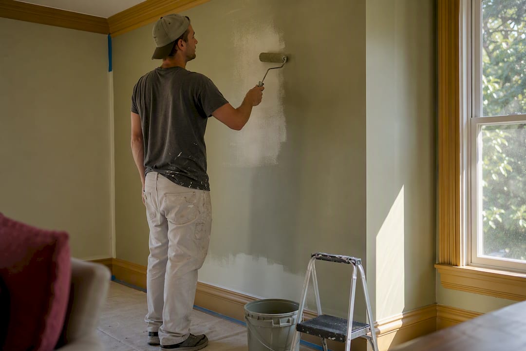
High contrast tends to energize a space; low contrast tends to soothe it. If your goal is a restful bedroom, keep your wall, trim, and major furniture pieces within a narrow value range rather than pairing a pale blue wall with stark black furniture and white bedding, which injects visual tension even into a “calming” color scheme. If your goal is an inviting, social living room, a bit more contrast, a warm terracotta wall against cream trim and a deep green accent chair, adds the visual energy that makes a space feel lively rather than flat.
Door color plays a bigger role in this than most homeowners expect. A door painted in a contrasting accent tone can frame a room’s palette and change how the whole space reads, sometimes more dramatically than swapping a wall color would. Before you repaint an entire room chasing a mood, try testing a bolder door or trim color first. It’s a smaller, cheaper way to shift contrast and see how the room responds.
Why Your Lighting Changes What Color You Actually See
The paint chip you picked at the store was almost certainly viewed under fluorescent showroom lighting, which skews cooler and flatter than most home lighting. That mismatch is the single biggest reason homeowners feel surprised, or disappointed, once a color goes up on their own walls.
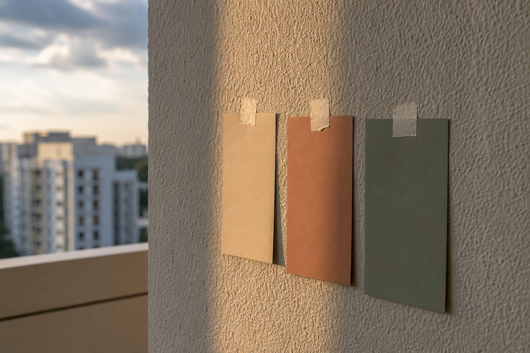
Warm-toned LED and incandescent bulbs (around 2700K to 3000K) push colors toward yellow and amber, which can make a cool gray read greenish or a crisp white look cream. Cooler LED bulbs (4000K and up) do the opposite, pulling blues and grays toward a sharper, sometimes clinical tone. Daylight shifts throughout the day too: morning light tends to feel cooler and bluer, afternoon light warmer and more golden, and evening artificial light depends entirely on your bulbs.
This is exactly why a poster-sized test swatch matters more than a paint chip. Tape it up and check it under your bedside lamp, your kitchen’s overhead fixture, and daylight through the window, because a color that reads calm and cool at noon can turn muddy or flat once your evening lighting kicks in. If you’re set on a specific mood, mention it when choosing bulbs, not just paint. A carefully chosen calming blue can lose most of its effect under the wrong light temperature.
What the Research Actually Tells You to Prioritize
Most advice on room color psychology treats hue like it’s the whole story: pick blue for calm, pick red for energy, done. The research doesn’t support that level of simplicity. Lightness and saturation move the emotional needle as much as hue family does, and orientation and lighting can flip how a “correct” color choice actually performs in your specific room.
The conventional wisdom also underplays how personal this is. A shade linked to calm in aggregate data can carry a stressful association for someone with a specific memory tied to it, which is exactly why testing matters more than trend lists. If I had to name the one step homeowners skip that causes the most regret, it’s the lighting check. People sample a color at 2 p.m. on a sunny Saturday and never look at it again before buying five gallons.
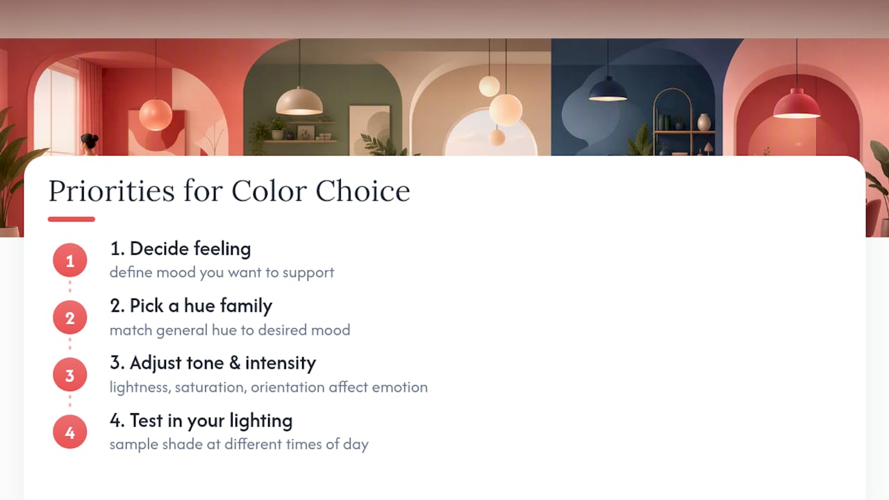
Prioritize in this order: decide the feeling you want the room to support, choose a hue family that matches it, then test that specific shade under your own lighting at different times of day. Skip straight to a favorite color without that sequence, and you’re gambling on a look that only exists in the store.
— Fabian
Get the Color Payoff Without the Guesswork of DIY
Picking the right shade is half the job. Getting it on your walls evenly, without patchy coverage, bleed-through, or a rushed finish that dulls the color you researched, is the other half, and it’s where most DIY repaints fall short. 5starpainting handles both sides: our team preps every surface properly, applies genuine Nippon Paint in the exact finish your room calls for, and assigns one project manager to your job from start to cleanup, so the color you tested on your wall is the color you actually live with.
Pricing is all-inclusive, covering labor, paint, furniture protection, and cleanup, with no hidden add-ons once the crew arrives. If you’re weighing a full repaint after reading through these room-by-room recommendations, our HDB painting packages start from $600, and our condo painting services start from $950. Head to 5starpainting to get a quote based on your rooms and preferred colors.
Sources
- Interior Color and Psychological Functioning in a University Residence Hall – PMC
- What color should I repaint my home? Ask a psychologist – Medical Xpress
- Interior Paint Colors That Actually Affect Your Mood: A Color Psychology Home Guide by Room