
Warm neutrals, sage and olive greens, terracotta and honey tones, and moody blues or charcoal are the strongest living room paint colors for 2026, replacing the cool grays that dominated the last decade. Each family behaves differently depending on your light and furnishings, so before you commit to a full gallon, paint sample patches on at least two walls and check them in morning, afternoon, and evening light.
TL;DR:
- Over 2026, warm neutrals, greens, and terracotta will dominate, but all samples should be tested in different lighting conditions and against existing furniture.
- The 60-30-10 rule helps build effective color schemes, with neutral walls, supporting secondary hues, and accent pops, depending on the room’s natural light and size.
- Sheen impacts color depth; eggshell or satin finishes balance durability and appearance, and sampling on multiple walls is essential for accurate color selection.
- Testing samples on three walls over several days, in morning, afternoon, and evening light, prevents costly mistakes and ensures the color works in your space.
- Professional painters improve final results in challenging rooms, with full prep, consistent application, and post-job warranty, especially for dark or saturated shades.
Table of Contents
- Choosing Living Room Paint Colors: The Trending Families for 2026
- 13 Living Room Color Combinations That Actually Work
- How to Choose Living Room Paint Colors for Your Space
- How Sheen Changes the Way Your Paint Color Reads
- How to Test Living Room Paint Colors Before You Commit
- What Professional Painters Get Right That DIY Testing Often Misses
- How Living Room Colors Affect Mood and Atmosphere
- Coordinating Wall Color With Flooring and Decor
- Common Mistakes When Choosing Living Room Paint Colors
- How Lighting Type Changes the Way Paint Colors Look
- What the Research Actually Supports for 2026 Palettes
- When It’s Time to Bring in a Professional Painter
- Sources
- FAQ
Choosing Living Room Paint Colors: The Trending Families for 2026
Interior color trends for 2026 are moving away from stark whites and cool grays toward tones that feel lived-in and warm. Designers are steering clients toward earthy, warmer palettes like sage green, terracotta, honey-amber, and mushroom neutrals, and the shift shows up in nearly every trend report this year.
Warm neutrals remain the safest long-term bet. Soft beiges, greige, and mushroom tones recede behind furniture instead of competing with it, which makes them forgiving choices for homeowners who redecorate often. Try Benjamin Moore’s Revere Pewter or a warm greige like Balboa Mist as starting points.
Sage and olive greens have become the default “safe but interesting” choice this year. They’re grounding, pair naturally with wood furniture and houseplants, and shift character with the seasons and available light, reading cooler in winter and richer in summer. Sherwin-Williams Clary Sage and Farrow & Ball’s Bancha both work as reliable samples.
Terracotta and honey-amber bring a golden-hour glow that photographs beautifully but needs testing, since it can shift orange in cool artificial light. These tones work best in rooms with generous afternoon sun.
Moody blues, charcoal, and dark teal are climbing fast, but they’re not universal. Deep, saturated colors reward rooms with strong natural light or layered artificial fixtures and can feel cave-like in a dim, north-facing space. Benjamin Moore Hale Navy and a deep charcoal like Kendall Charcoal are common reference points.
A few practical anchors to sample from each family:
- Warm neutral: Revere Pewter, Balboa Mist
- Sage/olive: Clary Sage, Bancha
- Terracotta/amber: a warm clay or honey-toned sample from your local paint counter
- Moody dark: Hale Navy, Kendall Charcoal
13 Living Room Color Combinations That Actually Work
A reliable palette follows the 60-30-10 rule: 60% dominant color (usually the walls), 30% secondary (upholstery, drapes, or an accent wall), and 10% accent (pillows, art, trim details). These combinations apply that structure across a range of styles.
- Warm greige walls, cream trim, rust accents. Neutral base with a terracotta punch in pillows or a throw.
- Sage green walls, natural oak tones, brass accents. The grounding green plays off warm wood and metal.
- Soft white walls, sage green cabinetry or trim, olive accents. Good for open-plan living/dining spaces.
- Charcoal accent wall, warm white surrounding walls, mustard accents. Adds depth without darkening the whole room.
- Terracotta walls, cream trim, deep green accents. A nature-inspired combination with real warmth.
- Mushroom neutral walls, black trim, camel upholstery. Modern and moody without going fully dark.
- Navy accent wall, warm white surrounding walls, brass fixtures. Classic and works in rooms with good light.
- Honey-amber walls, white trim, forest green accents. Cozy, autumnal, works well in smaller rooms.
- Pale sage walls, white ceiling, blush pink accents. A pastel-soft palette for a gentler mood.
- Deep teal walls, cream trim, gold accents. Dramatic, best with layered lighting.
- Warm white walls, taupe furniture, terracotta throw pillows. Flexible and easy to update seasonally.
- Olive green walls, black window frames, rattan textures. Earthy and textural, popular in 2026.
- Clay walls, white trim, dark wood furniture. Warm and grounded, ideal for rooms with wood flooring.
Keep the ceiling in a soft white or a slightly lighter tint of the wall color unless you’re deliberately trying to lower a high ceiling visually.
How to Choose Living Room Paint Colors for Your Space
Start with your light. South and west-facing rooms get warm, golden light that intensifies warm tones and softens cool ones. North and east-facing rooms get cooler, flatter light, which can make warm neutrals look muddier and blues look colder than the chip suggested.
Room size matters just as much; for advice on making the most of your home’s space, see this guide on how to find spacious homes in Singapore. Light colors bounce light around and make a small living room feel more open, while dark, saturated colors can make a large room feel more intimate, sometimes a welcome trade in a cavernous space. If your living room runs small, pairing a lighter wall color with a similar-toned ceiling helps blur the corners; a related approach appears in this guide on small room paint colors.
Undertones trip up more homeowners than any other factor. A “greige” can lean pink, green, or purple depending on the manufacturer, and it only reveals itself next to your existing furniture, floor, or trim. Before ordering a full gallon, run through this checklist:
- What direction does your main window face, and at what time do you actually use the room most?
- What flooring, cabinetry, or built-ins are staying, and what undertone do they carry?
- Are there large rugs or upholstered pieces you’re keeping?
- Does the color still look right next to your trim color, not just on its own?
Pro Tip: Hold your paint chip against your flooring and biggest piece of furniture in daylight and again under a lamp at night. If the color still looks intentional in both, you’ve found a keeper.
How Sheen Changes the Way Your Paint Color Reads
The finish you pick changes how saturated and deep a color looks, sometimes more than the color itself. Flat and matte finishes absorb light, which makes a color read darker and richer but shows less wear resistance. Eggshell and satin reflect more light, brightening the same color and making walls easier to wipe down.
For living room walls, eggshell or satin usually strikes the right balance between depth and durability, especially in households with kids, pets, or high foot traffic. Reserve flat finishes for ceilings or low-traffic accent walls where a matte look is a feature rather than a maintenance headache.
- Flat/matte: deepest color, least durable, best for ceilings or formal accent walls
- Eggshell: slight sheen, easy to clean, the standard choice for most living room walls
- Satin: brighter and more washable, good for high-traffic living rooms
- Semi-gloss/gloss: best reserved for trim and doors, not full walls
A satin or semi-gloss finish on trim also makes cleanup simpler over time. This guide on cleaning painted walls breaks down what each finish tolerates.
How to Test Living Room Paint Colors Before You Commit
Skipping the testing step is the single most common reason a finished room disappoints. A dependable at-home method takes about a week and costs less than a mistake:
- Narrow your choices to three candidate shades.
- Paint 12-inch by 12-inch patches on at least three different walls, since each wall catches light differently.
- Photograph each patch at morning, afternoon, and night to see how artificial light shifts the tone.
- Drape a sample of your rug, throw pillow fabric, or curtain fabric near the patch to check how the color pairs.
- Wait 48 hours before deciding. Paint often looks different once it fully cures and dries to its true tone.
Testing samples this way is the most reliable predictor of how the final room will actually look, far more reliable than a swatch under store lighting. Clean the wall and lightly sand any glossy patches before applying samples, since paint adheres unevenly over old sheen. Small sample pots (roughly one pint) are available at most paint counters and cover two or three test patches. A similar five-step approach for testing under specific light conditions is detailed in this bedroom paint color guide.
What Professional Painters Get Right That DIY Testing Often Misses
Surface prep affects the final hue more than most homeowners expect. Unpatched holes, uneven old paint, and skipped primer all cause a single color to look blotchy or shift tone across a wall, an issue that shows up weeks after the job looks finished, not on the first coat.
A consistent crew and a single point of contact also matter more than people assume. When different painters mix batches or apply coats inconsistently, color uniformity suffers, especially with deep or moody shades that show lap marks easily. Getting colour matching right on touch-ups later depends on the same consistency; this guide to colour matching paint covers the common pitfalls.
A practical five-step test before finalizing any color:
- Sample on at least three walls, not just one.
- View patches morning, afternoon, and after dark.
- Check the color against your largest fixed elements (floor, cabinetry, big furniture).
- Wait 48 hours after painting the sample before deciding.
- Confirm the sheen, not just the color, against your traffic and lighting needs.
Professional services typically bundle surface prep, genuine paint, furniture protection, cleanup, and a warranty into one all-inclusive quote, removing the guesswork around hidden costs that DIY projects often run into.
How Living Room Colors Affect Mood and Atmosphere
Color temperature shapes how a room feels to sit in, not just how it looks in photos. Warm tones like terracotta, honey-amber, and warm neutrals tend to read as cozy and welcoming, which is part of why they’re driving 2026 trends: after a long stretch of cool, minimalist palettes, people want rooms that feel inviting rather than clinical.
Greens sit in a middle zone. Sage and olive read as calming and grounded without feeling cold, which explains their popularity as a “safe but interesting” alternative to beige. They also tend to pair well with plants and natural materials, reinforcing that grounded, settled feeling rather than fighting against it.
Deep, saturated colors like navy, charcoal, and dark teal create drama and intimacy, but the effect depends heavily on execution. In a well-lit room with layered lighting, a moody wall color can feel rich and enveloping, like a room designed for evening conversation. In a poorly lit room, the same color can feel heavy or closed-in. That’s why lighting quality, not just personal taste, should factor into whether you go dark.
Bright whites and cool grays, once the default, tend to feel more formal or sterile by comparison. They’re not wrong choices, but they explain part of why 2026’s trend lists lean so heavily toward warmth: homeowners are actively choosing atmosphere over a strictly neutral backdrop.
Coordinating Wall Color With Flooring and Decor
Your flooring sets the undertone conversation before you even open a paint can. Warm wood floors with orange or yellow undertones tend to clash with cool blue-grays, while they pair naturally with warm neutrals, terracotta, and olive green. Cooler-toned floors, like gray-washed wood or cool-toned tile, open the door to blues and charcoal without fighting the base material.
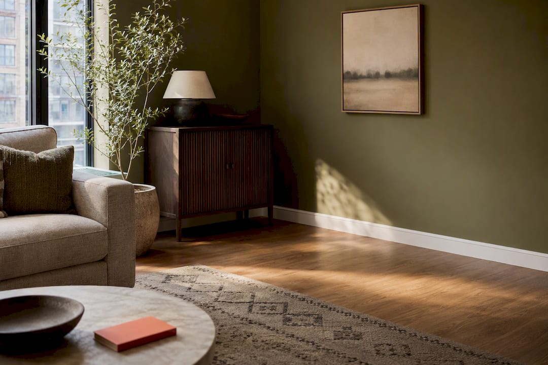
Rugs and large furniture pieces are the next layer. If you’re keeping a patterned rug or a bold sofa, pull one supporting color from it rather than trying to match every tone in the room. A single olive thread in a rug, for example, can justify a full sage green wall without the room looking overly coordinated or matched.
Wall decor and artwork should generally come after the paint color, not before, since a wall color is far more expensive and time-consuming to change than a gallery wall. If you already own significant art or a large mirror with a specific frame finish (brass, black, natural wood), test your paint samples with that piece nearby, since metal and wood tones interact strongly with wall undertones.
Trim and ceiling color deserve the same attention as the walls. A crisp white trim sharpens most palettes, while a trim tinted slightly warmer or cooler than the wall color softens the contrast for a more blended look.
Common Mistakes When Choosing Living Room Paint Colors
The most frequent mistake is skipping the sample stage entirely and trusting a paint chip under store fluorescent lighting. Paint chips are painted with a flat sample under controlled light, which rarely matches how the color behaves across your actual walls and windows.
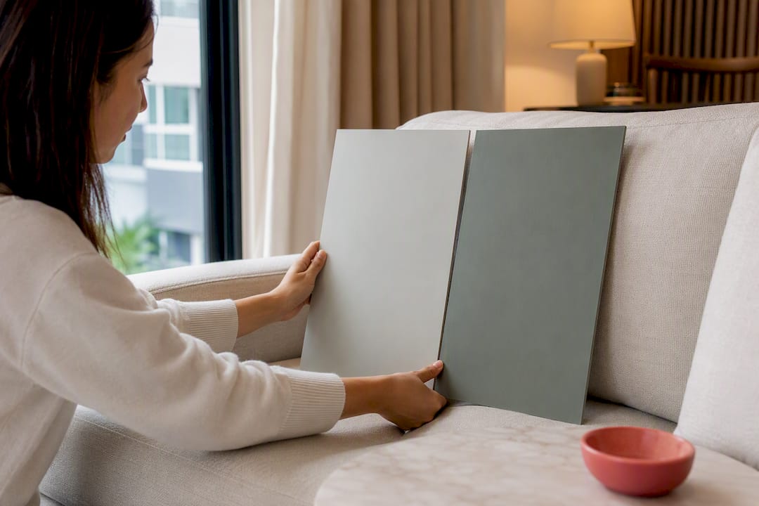
A close second is ignoring undertones until the paint is already on the wall. A “neutral” gray that reads lavender next to your sofa, or a “warm” white that turns pink under your ceiling lights, both stem from undertones nobody checked against the room’s fixed elements beforehand.
Choosing a color in isolation, without considering flooring, trim, and furniture already in the room, causes clashes that are expensive to fix. Painting an entire room in a bold, trendy color without testing how it reads at night under artificial light is another common regret, since a color that looks dramatic on Pinterest can feel dark and closed-in once the sun goes down.
Finally, many homeowners underestimate how much sheen affects the outcome, picking a finish based on habit rather than the room’s lighting and traffic. A flat finish that looked rich in the sample can look flat and dull once it’s on four full walls under everyday lighting.
How Lighting Type Changes the Way Paint Colors Look
Natural light shifts throughout the day, and your compass direction determines how forgiving your room is. South-facing rooms get the most consistent warm light, which flatters warm neutrals, terracotta, and olive greens. North-facing rooms receive cooler, flatter light all day, which can make the same warm tones look muddier and cool tones look colder than expected.
Artificial lighting adds another layer entirely. Warm-toned bulbs (around 2700K to 3000K) enhance reds, oranges, and warm neutrals, while cool-toned bulbs (4000K and above) sharpen blues, grays, and greens but can wash out warmth from terracotta and amber tones. If your living room relies heavily on lamps or overhead fixtures in the evening, test your paint sample under those exact bulbs, not just daylight.
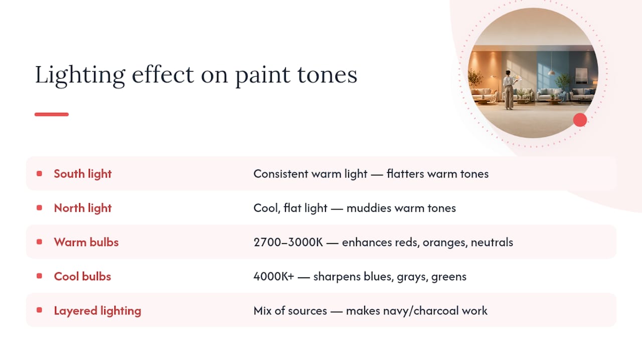
Layered lighting, meaning a mix of overhead, lamp, and accent lighting, is what makes moody colors like navy or charcoal work well in the evening rather than reading as gloomy. A single overhead fixture rarely provides enough depth for a dark wall color to feel intentional after sunset.
What the Research Actually Supports for 2026 Palettes
The loudest advice on living room color tends to treat trend lists as instructions: pick sage green because it’s popular, add terracotta because a designer said so. That’s backwards. The trend data matters, but only as a starting point for testing against your own light and fixed elements, not as a substitute for it.
Where conventional advice falls short is in treating sheen as an afterthought. Most guides spend paragraphs on hue and a single sentence on finish, yet sheen changes how saturated a color reads almost as much as the pigment itself. A “wrong” color in the right sheen often outperforms the “right” color in the wrong one.
If you take one thing from this, prioritize the testing sequence over the color name. Painting three 12-inch patches and living with them for 48 hours costs a fraction of repainting an entire room that looked perfect on a swatch and wrong on the wall. Trend families like warm neutrals and sage green are strong starting points precisely because they’re forgiving under imperfect testing conditions, not because they’re universally flattering.
— Fabian
When It’s Time to Bring in a Professional Painter
Testing samples and picking the right family get you most of the way there, but execution is where good color choices either hold up or fall apart. This is especially true for dark, saturated shades, large or high-ceiling living rooms, and any project running on a tight timeline where redoing a botched coat isn’t an option.

Professional painters handle the parts of a color project that are hardest to get right on your own: full surface preparation, genuine paint application, furniture protection, and post-job cleanup, often bundled in an all-inclusive quote. Having a dedicated project manager can keep color application consistent across every wall, which matters for certain challenging colors where uneven coats show. Warranties often back the finished work to provide assurance to homeowners. If you’re weighing whether to tackle a large living room or a dark accent wall yourself, start with a quote through the main services page, check HDB painting packages starting at $600, or look at condo painting services starting at $950 if you’re preparing a unit for move-in or resale.
Sources
- Best Living Room Paint Colors | 2026 – Bobby Berk
- Best living room colors – Decorilla
- 6 living room paint color trends you’ll see everywhere in 2026 – The Spruce
FAQ
What is the best color for living rooms?
There’s no single best color, but warm neutrals, sage green, and terracotta are the most versatile choices for 2026 because they suit most lighting conditions and pair with a wide range of furniture and flooring.
Which paint finish is best for living room walls?
Eggshell or satin finishes work best for most living rooms, balancing color depth with easier cleaning than flat paint and less glare than semi-gloss.
What is the most popular color to paint a living room right now?
Warm neutrals and sage or olive green are the most popular choices in 2026, replacing the cool grays that dominated trend lists for the previous several years.
How do I know if a color will look right in my living room?
Paint sample patches on at least three walls, view them at different times of day, and hold them against your flooring and furniture before committing to a full gallon.
Should I hire a professional for a bold or dark living room color?
Deep, saturated colors like navy or charcoal show inconsistent application more easily, so hiring a professional service like 5starpainting helps ensure even coverage and color uniformity across the whole room.